| |||||||||||||||||||||||||||||||
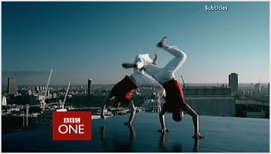
 2006-present day - After four years, the idents were replaced themselves by a new set introduced on 7 October 2006, abandoning the overtly red color scheme yet retaining the colour slightly less obviously as the main color. The relaunch brought about a new channel logo once more with the box replaced in favor of a lowercase name, effectively appearing as BBC One.
channel four

 1982-1992 - the first channel four ident was screened in 1982,The award winning Channel Four identity was designed in 1982 by Robinson Lamb-Nairn. They won the initial pitch against Michael Peters and Wolf Olins.
 From their initial presentation Lambie-Nairn researched Channel Four's philosophy and seized the fact that they would be buying all their programs in, so Channel Four would be a patchwork.
Their first idea was to illustrate the coming together of these elements. The first six ideas of 'coming together' all implied movement. One idea used the the colours of a television gun (RGB) and Channel Four liked the use of strong color and agreed the 'coming together' theme should be emphasised and developed further. they also make it so that it would link to a certain occasion for example in christmas they would add a christmas theme. they would also add themes such as sports themes which where added on 1984 and 1992 to celebrate different sports occasions such as the italian league they did a Italian football ident, they would also do idents to promote various programs such as, 'dinomania or atm comedy'.
1999 - they used this ident in 1999 they had various different colors to this ident, it was very basic however it included the new logo in white which we see today in channel four, it includes colors such as red, teal, purple and yellow to add a change to it.
2000-2013 - these are the most recent idents and the most modern they include the logo with a scene behind it for example in this photo there is a field of plants in this one, and in the most recent 2013 one there is the logo which is slowly made in different scene for example in this one it is a block of flats and bits of the flat combine to make the logo this makes the cannel more interesting and makes people want to watch it


No comments:
Post a Comment