I started off with this logo that had the purple E and the green 4 with the purple and white background, i used a specific shade of purple as i used the cooperate identity theory so people recognized it as E4, in the first logo modification i blurred the edges and added a effect to the 4 to make it abit more interesting, in the second logo i removed the striped background as i thought it wasn't very good, however i then released it didn't look the same so on the third logo i removed the blur and added back the background and also included some patterns on the fonts to make it more interesting.

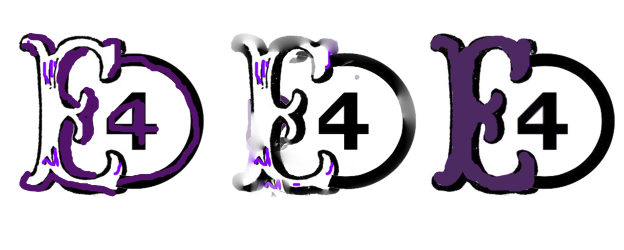
This logo started of just black and white however I then thought I would add a bit of purple due to corporate identity so people recognized it as E4, in the first modification I simple added a shade of purple replacing the black shadow, in the second one i added a blur effect giving it a mystical effect, however I then thought how I didn't like them very much so in the third and final one I simply shaded the E in with purple.

In this logo in started off with a purple e and a white 4 overlapping however i added the shade of purple to include the theory of corporate identity so people would recognize my logo as E4, on the first logo i added the circles in the E and also in the 4 to make it more interesting, i also did this in the second one however, in the second I switched the color round with the E and the 4, however i didn't really like this so i changed it back and in the third and final one I included a purple box around the E4 logo, to make it more recognizable making sure its the shade of purple made for E4.


D
ReplyDelete